Tuesday, August 5, 2008

Star Plots


http://www.humble-inc.com/rof_app99-2.htm

Star Plots compare single data points with different variables. For example, point 1 is larger than 3 but smaller than 2. The figure above is a star plot created from gas chromatographic analysis of oil samples using selected peak ratios.

Correlation Matrix


http://www.livestockgenomics.csiro.au/Genome_to_Phenome/

A correlation matrix is another type of graphic tool that is used to show the correlation or linear relationship between two variables. The graph that I have selected above demonstrates the “heat map of the tissue to tissue correlation matrix. Thick lines separate cancerous from normal tissues. The spectrum goes from blue (correlation <= -0.45) to white (-0.05 < correlation <= 0.05) to red (correlation > 0.45).”

Similarity Matrix


http://www.fxpal.com/?p=eventDetector

A similarity matrix is a graphic representation of scores that demonstrates similarity between two different data points. The matrix above shows how a collection of 512 photographs relate temporal and content similarity.

Stem and Leaf Plot


http://www.highpointsmath.com/sitemap/Stem-and-LeafPlot.html

A stem and leaf plot is a useful tool for visualizing the distribution of quantitative data. This is a useful devise for showing exact scores. For example, if you are a teacher and you want to know how the class did on an exam, this would distribute all of the test scores.

Box Plot


http://math.youngzones.org/stat_graph.html

A box plot is also known by box-and-whisker diagram. Box plots are useful because they can show outliers, statistics that are removed from the concentration of data. Box plot can be horizontal or vertical, and can handle large data sets; they are not useful for exact values.

Histogram


http://math.youngzones.org/stat_graph.html

A histogram is another type of graph used to demonstrate values of different variables. A histogram uses the size of the bars rather than the height to demonstrate the value. The histogram above illustrates the rates of cigarette smokers by sex and age in 1992.

Parallel Coordinate Graph


http://www.curvaceous.com/six%20sigma%20application.htm

The parallel coordinate graph above comes from a company that designs software; therefore this graph is an example of their work; pretty good. Each line on the graph represents a number of values and is connected with a different variable. It would be almost impossible to find and study one variable. The intention of this type of visual aid is to do a multivariate analysis by studying the concentration of lines; you want to look for patterns and omissions.

Triangular Plot


http://ex-parrot.com/~chris/wwwitter/20050407-it_doesnt_matter_how_you_vote_either_way_your_planet_is_doomed.html

This type of graph is suited to demonstrate the relationship between three different variables. If you are a registered voter in the U.K. you might be interested in the graph above that shows how voters are leaning in their general election from a poll taken in April, 2005.

Windrose


http://www.climate.washington.edu/climate.html

The windrose is a tool that has been used for a long time. The wind rose as depicted above is a modern version that depicts wind speed in different directions. The windrose usually shows 16 main directions such as North, North by North East, North East, etc.

Climograph


http://www.cotf.edu/ete/modules/msese/earthsysflr/savannah.html

This is a climograph of the savannah in Chipata, Zambia. A climograph is a visual representation of weather conditions of a particular area over time. Rainfall and temperature are the variable shown in this climograph. The bar graph represents rain and the line graph denotes temperature. By Florida standards Chipata, Zambia is a very dry environment.

Population Profile


http://www.ifad.org/operations/regional/pf/aids_1.htm

The population profile above represents the entire population of East and Southern Africa of males and females by age. This visual representation also shows the numbers of those infected with AIDS. According to this graph the largest age group is 20 to 25 for both sexes. This group also has the highest incidence of AIDS. It is interesting that at age 75 through 80 almost everyone has AIDS; strange.

Scatterplot


http://www.bcgsc.ca/platform/bioinfo/software/ds/primer/SAGE/

A scatter plot is a visual display that uses data of two separate variables; they are plotted on a graph as a collection of points from values that correspond to the X and Y axis. The scatter plot above is a comparison two types of SMO; a 95 and a 96. To be honest, I have no idea what an SMO is, nor do I care; I chose this because I like the colors.

Index Value Plot


http://www.mathworks.com/products/demos/shipping/garch/garchcopulaevtdemo.html?product=GA

An Index Value Plot is an image of data represented in the form of a graph. The index value is plotted on the Y axis while the date is plotted on the X axis. The Index Value Plot above shows a comparison of closing levels of the world market from 1992 through 2004. This shows Germany beating the pants off of the competition; farfegnugen!

Accumulative Line Graph or Lorenz Curve


http://www.qualityinfo.org/olmisj/ArticleReader?itemid=00003899

The Accumulative Line Graph of Lorenz curve is a graph that shows a probability of distribution. This type of graph id usually used to show income distribution as is the case in the representation above. The curved portion of the line depicts the higher wage earners and can be used to relate an example of social inequality.

Bilateral Graph


http://www.treas.gov/press/releases/

Bi-lateral, meaning two variables measured in the same direction. Above is a visual representation in the form of a bi-lateral graph that was put out by way of a press release by the U.S. Treasury. The variables measured are unemployment and new jobs due to Bush’s economic policies. This could also be considered a type of propaganda map.

Nominal Area Choropleth Map


http://mapmaker.rutgers.edu/355/links.html

This type of choropleth uses nominal scale data. Nominal refers to a scale of measurement. Nominal scale data has no particular order, nor can it be classified as greater than or less than. Nominal refers to the name of the subject data. The map above shows the churches of Hawaii over area and by name; Buddhist, Protestant, and Catholic.

Unstandardized Choropleth Map


http://www.tcrecord.org/Content.asp?ContentId=14626

An unstandardized choropleth map is a variant of a thematic map that uses data from a source that has not been standardized; the data is not common knowledge. The map above relates the areas of Uganda that has private schools versus those areas that do not.

Standardized Choropleth Map


http://www.portal.gsi.gov.in/pls/portal/url/page/GSI_STATIC/GSI_STAT_SEARCH_MAP_INFO

A standardized choropleth map used data that has been standardized; that it to say that the data is standard to a particular industry; everyone uses the same data. For example, standardized population data of the U.S. would come from the U.S. Census Bureau. The choropleth above uses standardized data to show geological information or rock classifications in India.

Univariate Choropleth Map


http://www.gismonitor.com/news/newsletter/archive/archives.php?issue=20060622&style=web&length=full

A univariate choropleth map only demonstrates one variable. The map above depicts unemployment in Portland, Oregon in the year 2000. Shading from light to dark demonstrates the degree to unemployment existed at that time. The author used four categories of shading to display this variable.

Bivariate Choropleth Map


http://www.geocities.com/stevejford/new_page_2.htm

A bivariate choropleth depicts two variables. The map of Africa above demonstrates life expectancy in years as compared with GNP per capita in U.S. dollars. The pie chart below the bivariate choropleth is a third variable that shows land use.

Unclassed Choropleth Map

http://www.math.yorku.ca/SCS/Gallery/milestone/sec5.html

Unclassed choropleth maps use continuous tone shading to depict values. There is no data chart, key, or schedule that goes with this type of map, thus we call it unclassed. The map above should be familiar to those who study maps; it is the first unclassed choropleth map; it represents the “distribution and intensity of illiteracy in France” and it was created by Pierre Charles François Dupin in 1826.

Classed Choropleth Map


http://www.ilstu.edu/~jrcarter/Geo204/Choro/Tom/
Choropleth maps are another version of a thematic map. The above choropleth is classed and represents the percentage of Hispanic or Latino people by county in Florida. The classes of a choropleth map are the variables that the map is depicting. Typically there are five classification methods used in a Classed Choropleth Map. They are natural breaks, nested means, equal interval classes, quartiles, and skewed distributions. The data for this map is compiled using the natural breaks method.

Monday, August 4, 2008

Continuously Variable Proportional Circle Map


//www.math.yorku.ca/SCS/Gallery/bright-ideas.html

Proportional circle are a form of cartogram. The image above shows how the continuously varying circles can represent the values of the cartogram. The image on the right has also been referred to as a circle-cartogram. This type of cartography depicts the point values as circles that may have an infinite number of sizes, to the extent that they can be shown and viewed practically.

Range Graded Proportional Circle Map


http://mapmaker.rutgers.edu/355/links.html
The image above is a variation of a dot distribution map. Circles of varying sizes are used instead of dots. The circles indicate point data and the size of the circles indicate the degree of the variable that is measured. In this case the variables are range graded; that is to say that they represent predetermined sizes. For example, the rural populations are noted as either 500 or 1000 – 2500. This map demonstrates the population of the areas surrounding Detroit and Chicago.

Monday, July 28, 2008

Digital Ortho Quarter Quad (DOQQ)


http://www.fireimaging.com/fires/2007/california/colina/253/index.html

A Digital Ortho Quarter Quad (DOQQ) is a digital image shown as an orthographic projection. It is also a combination of the best qualities of an aerial photograph and a map. The image above is of wild fires in California.

Digital Elevation Model


http://sst.rncan.gc.ca/ercc-rrcc/theme1/t9_e.php

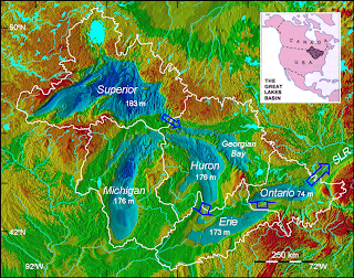
A Digital Elevation Model (DEM) is a type of topographic or terrain map. Many DEMs are shown as a grid of squares or raster. The data used to make a DEM are usually compiled using remote sensing. The DEMs are made by using regularly spaced elevation values which are tied-in horizontally either to a Universal Transverse Mercator (UTM) projection or to a geographic coordinate system. The U.S. Geological Survey (USGS) makes five main types of elevation data: 7.5-minute DEM, 30-minute DEM, 1-degree DEM, 7.5-minute Alaska DEM, and 15-minute Alaska DEM. According to the USGS they are no longer offering Digital Elevation Models as of November 2006. The DEM above is of the Great Lakes region and is a UTM projection. The purpose of this DEM is to demonstrate lower water elevations due to climate change.

DLG - Digital Line Graph

http://tahoe.usgs.gov/DLG.html
DLG is an acronym for Digital Line Graph. A DLG is a map of geographic features that is made from digital vector data to represent cartographic information. There are three different scales for digital Line Graphs, large scale, intermediate scale, and small scale. Large-scale maps are produced in 7.5- by 7.5-minute units; Intermediate in 30- by 30-minute units, and Small-scale maps are 1:2 million-scale topographic quadrangle maps. The DLG above is of Lake Tahoe; which is surrounded by several great ski destinations. Squaw Valley on the north end is my favorite.

DRG - Didital Raster Graphic

http://erg.usgs.gov/isb/pubs/factsheets/fs10602.html

DRG is an acronym for digital raster graphic; which is a scanned image of a U.S. Geological Survey (USGS) standard series topographic map. The image above is generated from raster elevation information of Juneau, Alaska. This is also a type of topographic map.

Isopleths

http://www.krisweb.com/kristenmile/krisdb/html/krisweb/maps/geomap_ten.htm

Isopleths are another form of contour line that connects areas of equal numerical value. In this example areas of equal rainfall are connected by Isopleths. So, Isopleths can be used as Isohyets which are used exclusively for rainfall; in extension, isohyets are a form of isopleths.

Isohyets

http://www.malagaweather.com/karten.htm

Isohyets are contour lines drawn on a weather map connecting points that receive equal amounts of rainfall. I chose this image to demonstrate that the rain in Spain falls mainly on the plane Portugal.

Isotachs

http://www.ssec.wisc.edu/media/April2003.html
Isotachs as pictured above are lines on a weather map or chart that connect points where winds of equal speeds have been recorded. An isotach is a type of contour line used on meteorological maps for demonstrating wind speed. This image is of part the Pacific Ocean and was produced in January 29, 2003 from a satellite orbiting Earth called GOES-10; the Isotachs are an overlay.

Tuesday, July 8, 2008

Isobars


www.netweather.tv/forum/index.php?showtopic=10660

Isobars represent areas of equal atmospheric pressure. The isobars connect equal points of pressure and the distance between isobars is the change or difference in atmospheric pressure. Lines that are close together mean stormy weather. Of the hundreds of isobar images that I could have chose I selected this one for its vibrant colors;" it dates back to the 16th October 1987. The cartoon at the top was entitled "making isobars with elastic bands."

Thursday, July 3, 2008

LIDAR


www.mlo.noaa.gov/.../gmdlidar/general_info.html
LIDAR stands for light detection and ranging. Lasers are used to measure the distance between an object and the laser source. The time delay between transmission and the collection of the reflected pulse is measured and a distance is calculated. In the photo above is of the actual laser being used, not a LIDAR image.

Doppler radar

www.bom.gov.au/.../new_radar_services.shtml

This is a Doppler image from the Bureau of Meteorology in Australia. Doppler is a radar image and another form of remote sensing. Mostly, it is a forecasting tool that is extensively used in weather prediction. Doppler was the name of the scientist that discovered this particular principle that sound waves can be deflected. In today’s usage radar sends out radio waves which are deflected off of objects in the air such as rain snow, or hail; some waves are scattered and others are sent back to the radar antenna. The information is then electronically converted into pictures showing the location and intensity of precipitation.

Black and White Aerial Photo

andrewprokos.com/.../aerial-view-black-white/

This is a beautiful black and white aerial photo of the beautiful Brookline Bridge. I have personally driven over this bridge and sailed beneath her; like a beautiful woman, she is very impressive up close. Aerial photography is a form of remote data collection of reflected energy from the sun. The reflected energy can also be classified as “passive sensors.” The use of black and white film narrows the band range of electromagnetic radiation (EMR) omitting the colors.

Infrared Aerial Photo

www.hutchville.com/tupper.shtml
Above is an infrared aerial photo of Tupper Lake in New York State. An infrared aerial photo is a form of remote sensing technology. The photo captures reflected or natural electromagnetic radiation (EMR). Infrared is a portion of the EMR that is not naturally visible and therefore a chemical must be added to the film in order to display the infrared spectrum.

Cartographic Animations

Ia Drang and Landing Zone X-Ray

Cartographic animations are a dynamic visual representation of a geographic area over time. The one that I chose for this post is a flash animated battle map of Landing Zone X-ray during one of the first battles of the Vietnam War between the 7th Air Cavalry and the People's Army of Vietnam. The battle spanned a time period of 48 hrs. To view the animation you will need to click on the URL above, and then click on the individual maps labeled LZ X-ray Map1, 2, and 3.

Tuesday, July 1, 2008

Statistical Map

www.sissa.it/he/statistical/links.html

A statistical map demonstrates how a particular variable is distributed throughout a geographic area. This map happens to be a statistical map of my ancestral country; Italy. This is a copy of an interactive map that when clicked on demonstrates statistical groups and institutions within Italy.

Cartogram

amphibiaweb.org/amphibian/cartograms/

A cartogram is another type of thematic map that distorts area for the purpose of demonstrating an attribute or feature. This map deals with amphibian diversity by Country; I chose it for its soothing shades of green.

Flow Map

www.iaspei.org/brochure/brochure.html

A Flow Map shows the direction of movement or the sequencing and ordering of information. Flow diagrams can also be used to show cause and affect relationships. Since global warming seems to be on everyone’s mind I chose the map above which shows global heat flow and was compiled from data by the International Heat Flow Commission.

Isoline Map

www.esri.com/news/arcwatch/0207/feature.html

An Isoline map is a variation of a thematic map because like a thematic map it shows data of a specific subject for a specific purpose. Information is related through the use of lines that connect points of equal value. The map above demonstrates the amount of rainfall—from 250 mm annually to 11,000 mm annually that falls on the island of Maui, Hawaii; a place that I would not mind visiting.

Thursday, June 26, 2008

KML File - Week 7 assignment

http://coastal.er.usgs.gov/remote-sensing/advancedmethods/DRTO/drto_bathy_index.kmz
This KLM file on Google Earth is of the Dry Tortugas National Park (DRTO) in the Florida Keys. When you run the file you will see that this place is anything but dry. There are approximately 79 interactive location pins in this file. The pins represent submerged Topography data with a DEM image. The data pins are organized to make up a grid of 2 km x 2 km tiles. There is also an elevation color bar at each location which demonstrates both surface topography, and submerged topography.
http://coastal.er.usgs.gov/remote-sensing/advancedmethods/googleearth.html

Sunday, June 15, 2008

Proportional Circle Map

http://www.cscs.umich.edu/~crshalizi/slothblog/2006/
Above is an extreme example of a proportional circle map; this is also an example of a cartogram. This map is demonstrating the Red-Blue political divide in the US. It is broken down county by county and it is area proportional. The color demonstrates how the counties voted for either party (red/Republican, blue/Democrat) during the 2000 Presidential election. The intensity of the color signifies the degree to which the counties voted Democrat or Republican.

Thursday, May 22, 2008

Dot Distribution Map

http://www.ncaction.org.uk/search/entry.htm?id=1447

Dot distribution maps are a type of thematic map. The theme of this GIS dot map is the population in Brazil. For this map each dot represents 100,000 people. This type of map is an efficient way to demonstrate the location of population concentrations.

Propaganda map

http://www.libertythink.com/2005/08/globalization-uber-alles-ftaa-decline.html

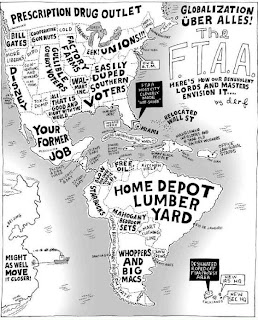
A propaganda map contains Information that is spread for the purpose of promoting some cause. The map above was constructed to demonstrate the reason for the “decline of America;” the FTAA is the Free Trade Area of the Americas.

Tuesday, May 20, 2008

Hypsometric map

http://iodeweb5.vliz.be/oceanteacher/resources/other/GISModules/Module_h/module_h2.html

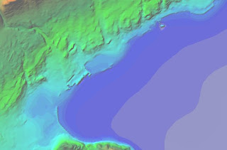
Hypsometric maps are a form of topographic map. Similar to topographic maps, hypsometric maps show changes in elevation; however, the difference being that hypsometric uses color to denote changes, whereas, topographic maps use lines.

Topographic Map

http://www.geo.mtu.edu/volcanoes/fuego/topoair2.html
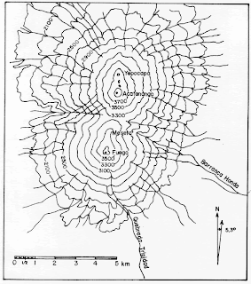
Above is a topographic map of twin volcanoes named Fuego and Acatenango; which are located in Guatemala. On this map, each contour line represents a change in elevation of 200 feet. Contour lines that are close together denote sharp changes in elevation; conversely, the greater the distance between topographic lines, the more gradual is the slope.

Monday, May 19, 2008

PLSS MAP

http://nationalatlas.gov/mld/plss00p.html

PLSS refers to the Public land Survey System. This is a grid-like system used in most of the United States to survey and record land ownership. The PLSS usually contains or is formatted from Township, Range & Section Boundaries. Above is a sample map from the US Geological Survey (USGS) demonstrating a PLSS map.